
Liberation Festival Haarlem
A festival for freedom
Synergique designed the branding and decor for Liberation Festival Haarlem, the Netherlands biggest liberation festival, for five years. We created posters, signage, the website and the stage design. Throughout the years we developed the festivals identity, both quirky and recognisable and always based upon solid content-driven concepts. With these concepts we could combine Liberation Festival Haarlems look with spatial and interactive projects.
In one edition, for example, a cube was the basic shape the featured in a.o. stage design and signage. The cube represented the notion of freedom and made its appearance in an interactive project in which Haarlems citizens could share their thoughts on freedom with festival visitors, by answering the question: where do you feel free? The confined space and the use of striped tape emphasized the physical aspect of freedom.
CLIENT
STICHTING BEVRIJDINGSPOP, HAARLEM
Term: 2008 – 2011
Location:Haarlemmerhout, Haarlem
Visitors:150.000 every year
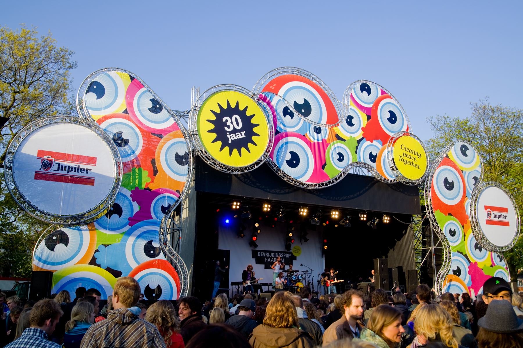
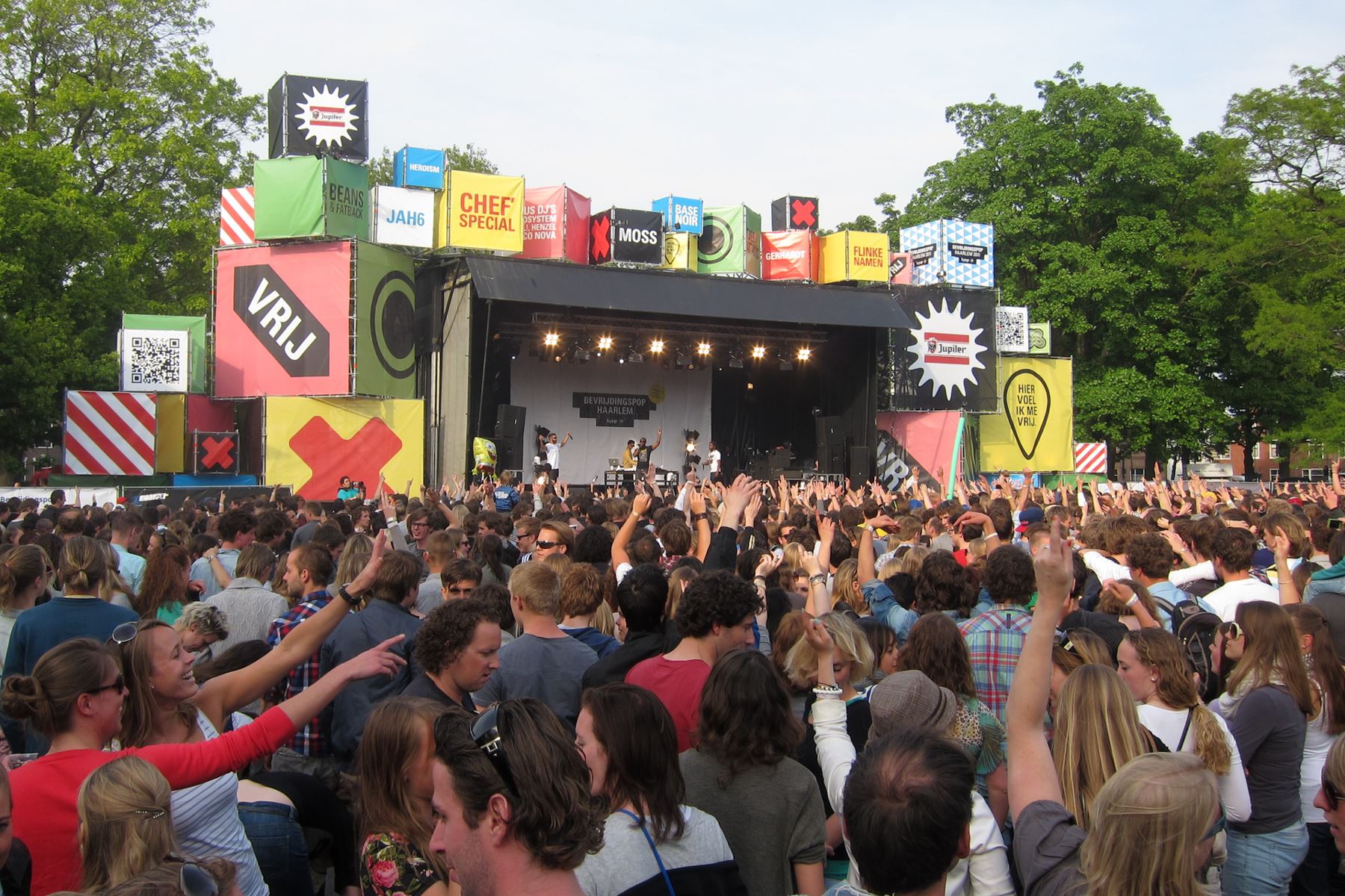
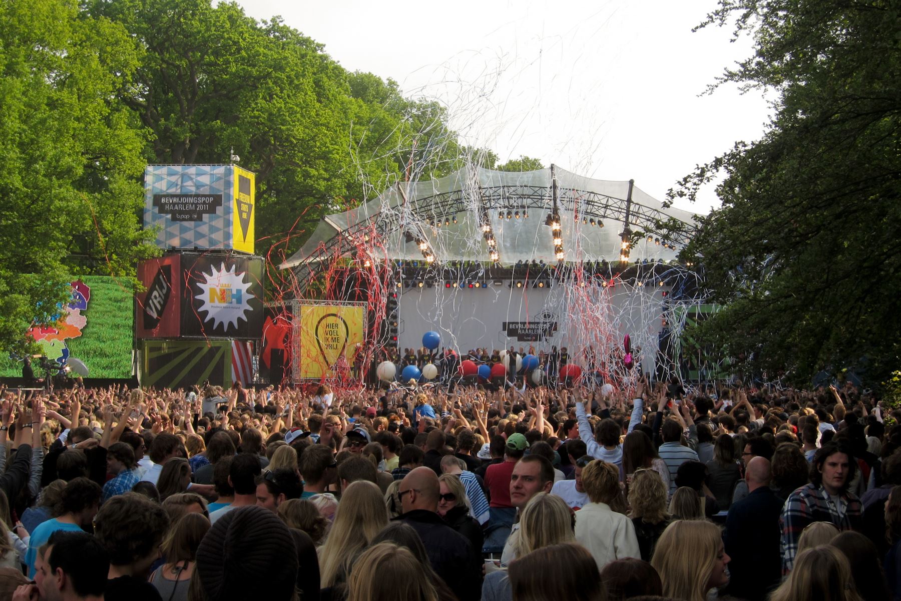
The cube played an important role in the design in the year 2011. The cube symbolised the stage Liberation Festival Haarlem offers musicians, as well as a platform where citizens of Haarlem can share their ideas on freedom with the festival visitors.
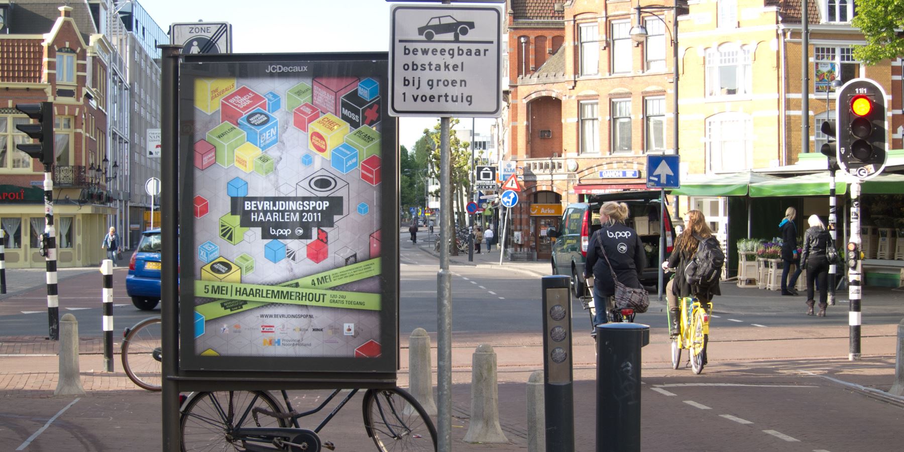
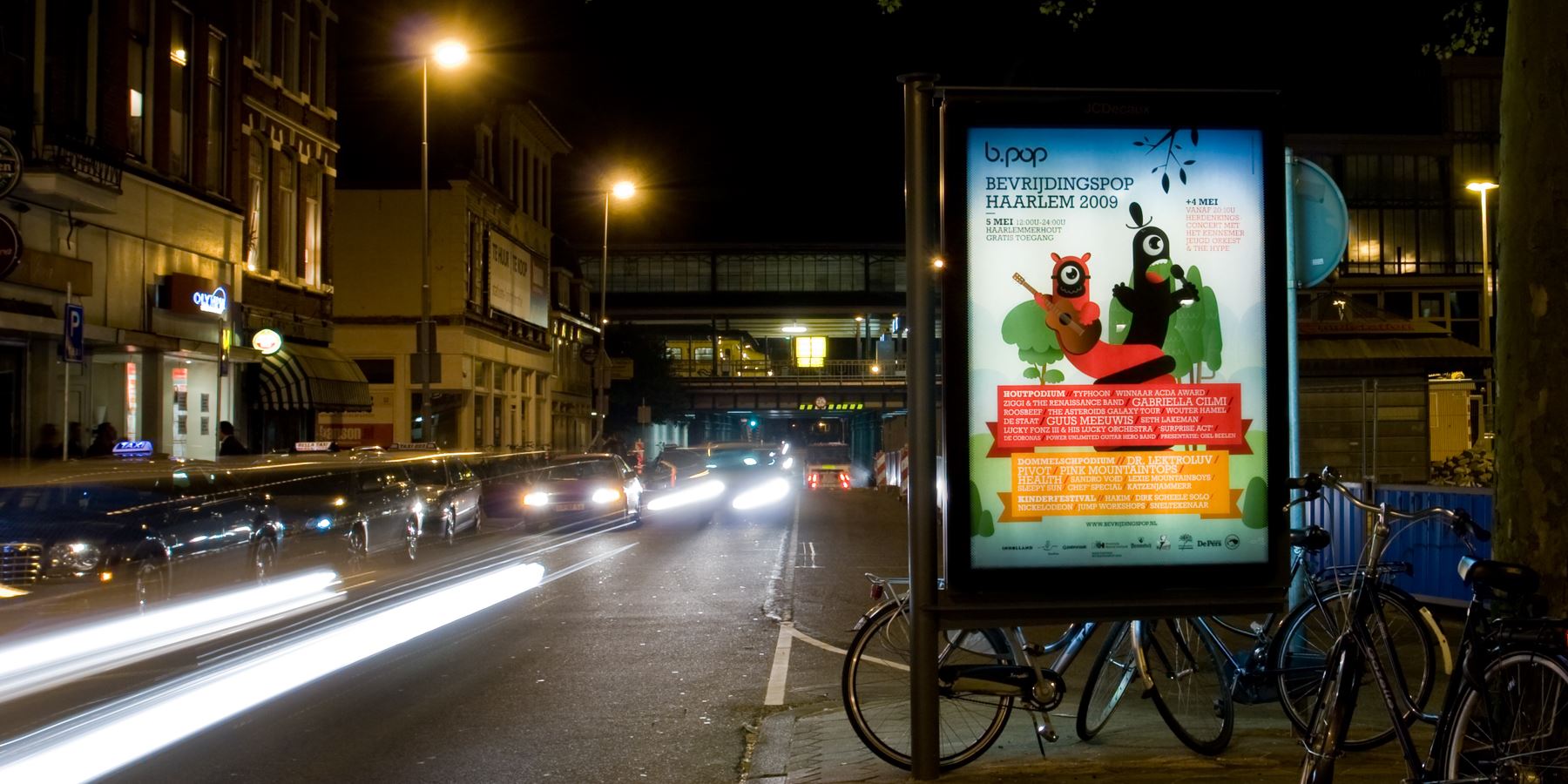
There’s no festival without a poster, a Liberation Festival is different however. The focus at a Liberation Festival isn’t on the line-up, it’s on the message of freedom that the festival wants to convey. This principle is evident on the posters.
We don’t lose track of the festival theme when announcing the lineup. The thematic texts that are layed out in style of the festival identity are recurring everywhere.